
I’ve done several of these posts so far, but left the Secret Seven as, honestly, I don’t rate them as highly as I do most of Blyton’s other series.
Janet and Peter
For completeness sake, and as there wouldn’t be enough to do a whole post on them, we’ll start with the two prequels to the Secret Seven. At Seaside Cottage (1947) is about Peter and Janet, while Secret of the Old Mill (1948) introduces the other five and sees them begin their secret society.
Both books have beautiful Eileen Soper wrap-around dust jackets.


First editions
The Secret Seven books were published by Brockhampton between 1949 and 1963, and had three different illustrators.
First up was George Brooks with books 1-4, then George Kay with books 5-7, and finally Burgess Sharrocks completed the series with books 8-15. My initial impression is that like with the Noddy books later artists go a good job of keeping the style and look consistent, but will that hold up to a closer examination?
Interestingly there are also three different styles of first editions – though these don’t align with the changes of artist.
Book 1, The Secret Seven is the only one to have the illustration contained in a circle.

It then had a second hardback edition – also by Brockhampton – in 1950, which matched the style for books 2-10. The three below are George Brooks covers. As you can see the new edition of the first book features the same scene but in full.


Then here are three by Bruno Kay. Although not shown above, all the covers did have an illustrated spine showing either more of the scene on the front, or a vignette of another part of the story.


And three by Burgess Sharrocks, the final four books of the series dropped the banner at the top and placed the text straight on the illustration. That works fine on a pale cloudy-sky but on top of the slatted shed it’s a bit harder to read.
Having looked more carefully I think that Kay and Brooks are very difficult to tell apart, while Sharrocks is slightly different, though it’s subtle and could easily be attributed to the passage of time/changing of popular style for cover artwork.


I’ve seen the banner style covers on other books – Eric Leyland is the main one which comes to mind – although it’s hard to find good-quality pictures of his books, or much information really. I gather he was an author of adventure stories for boys around the same time Blyton was writing.

It’s also worth mentioning that the first editions had printed boards under the dustjackets. I always referred to them in my head as the paper doll covers, as that’s what the line of hand-holding children looked like to me. And then I wrote that online and someone gently pointed out that they are the Seven children of the Secret Seven. I guess that makes more sense!
All of mine are blue, but there are several other colours they came in. Books 13-15 had the painted ‘S’ on them.


Seeing double (or triple) with Knight and Brockhampton
The first paperbacks came five years after the final book was first published and were by Knight.
Books 1 and 2 had two Knight paperbacks, both using the same artwork by Derek Lucas. This was then used again by Brockhampton to produce a series of Hardbacks. Books 3-15 used the second style of Knight paperback, and the the Brockhampton Hardback.


As you can see these use the same artwork, though the positioning and colourings are slightly different, as are the title banners.
The Brockhampton ones are mostly missing from the Cave which makes me wonder if they were only produced in small numbers.
Anyway, these are pretty decent covers.
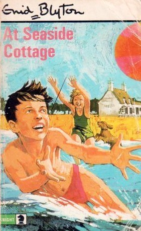
Also done in this style is a paperback (the only one as far as I know) of At Seaside Cottage. This isn’t in the Cave of Books so I don’t have a date or artist.
The uncredited era
Knight then produced three more paperback editions between 1976 and 1987, all of them with uncredited covers.
Up first are the random children from 1976, who are not from a TV series, but have been photographed as the Secret Seven. (See also the photo covers for the Five Find Outers)
I may have been unkind in my choices (I more or less picked randomly) as none of these are great covers.


First we have children in a tree. Admittedly this probably looks a lot better on a full-sized book rather than a small photo online, but it took me a minute to realise they weren’t scrambling up a grassy hill.
Then we have, at least, an action-shot, but it looks exactly what it is – staged.
And last we have children sitting about – perhaps looking at something that we can’t see -doing nothing. How thrilling!
After that, we have what I can only describe as bad hallucination covers from 1984. I do love a good optical illusion but these are wild. They’re so bad they feature in my rundown of Worst Ever Blyton Covers.
Below are three of them, not the worst ones as they’re already in the link above, but still. They remind me of bad sci-fi where improbable things like ten-foot spiders attack.


It’s as if they couldn’t decide which scene to feature so thought why not have them all? Regardless of whether it makes sense or instead makes it look as if giant children/dogs/walls are taking over the world. No wonder these are uncredited – even though the actual individual scenes are perfectly well drawn, would you want your name attached to these?
And finally, and probably the best of this uncredited Knight run from 1987 are these colourful ones. They definitely look dated now, but they at least have interesting scenes which convey action. The action-scenes combined with the 3D effect of the covers make it seem as if the characters are sometimes about to burst out of the book and into the real world.


And I will leave it there for tonight. I reckon I’ll get two more posts out of the remaining covers.


Great article, Fiona. I have all bar book 15 as Knight paperbacks with cover & illustrations by Derek Lucas which I’ve always really liked (“Green Knight means they are by one of their most popular authors”!)
I’ve always liked the illustration of the heads of all seven members + Scamper which feature on the first few pages of each book. It helped me picture the characters more vividly.
I always thought I had a copy of book 15, “Fun for the Secret Seven” but it was nowhere to be found when they came out of my loft 3 months ago so I recently bought a copy on eBay but sadly the cover is the 1984 staged picture version (awful), but all illustrations inside are by Derek Lucas.
I agree with your comments above about the good and less-good (awful?) covers.
LikeLike
I had forgotten about author Eric Leyland.
Must investigate further. Thanks for the tip.
LikeLike
I believe the 1949 edition of the first book ‘The Secret Seven’ printed board was a plain cream with the title in red letters. It had the dust jacket with the main picture illustration within a circle. Do you know if there was a 2nd impression of this book printed in grey with the title in red letters?
LikeLike
I can’t say I’ve seen that combo, but that’s not to say that it doesn’t exist. You may have more luck asking somewhere like the Enid Blyton Society forums where there are a large number of enthusiasts to potentially answer.
LikeLike