
We all know that I am a big fan of the original artwork for Enid Blyton’s book, though I have a soft spot for the 60s Armadas and the recent Ruth Palmer covers. Amongst all the modernised covers (which look just as dated now as the originals do, but without the vintage charm) there are some true horrors.
I’ve only gone through a few series so far but these are the worst I have found.
Stories for You, Dean
From the Dean’s Reward series (I would assume these are from the 90s as they use the same ‘upside down’ polaroid style covers as other from that time) this is the final version of the book.
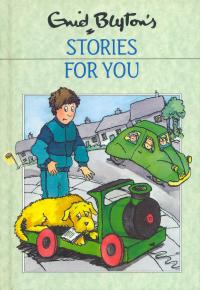
I’ve seen some bad covers in my time digging through the Cave but this is definitely one of the worst. The shell suit is horrendously 90s and dates it so badly, while everything else is squeezed in regardless of whether it fits or not. The houses overlap, the car (which looks bent in the middle) looks as if it will just tumble off the cover the road is so steep, while the flat train sits on the extremely curved pavement.
Adrian Chesterman’s Famous Five
I feel sorry for Adrian Chesterman as I’ve picked three of his covers! If you visit his website you can see that the digital artwork he produced in 2016 is actually impressively detailed. However shrunk to paperback-sized a lot of that is lost, drawing your attention to the somewhat comical looks of shock and terror on the children’s faces. In particular, the covers doesn’t really convey anything about the book, instead Smuggler’s Top looks look as if it’s set in a frozen cabin, while Hike has a ghostly fog in the background and the children in Off to Camp look completely super-imposed.


A couple more Famous Fives


Five Go Off to Camp by David Tazzyman is a baffling cover. First, I know I like a bit of leaning on a book cover, but this lot look as if they’re about to pitch forward onto their faces. And what odd faces they are. Not to mention the impossibly thin arms and legs, clown feet and the person in the background who appears to be jumping over a tent?
Then we have Five Go Down to the Sea by Richard Jones. This is another digital cover, and the two boys look completely gormless and as if they, too, are about to tumble face first to the ground.
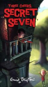
Many Secret Sevens


First, two different versions of The Secret Seven. The first is from 1984, a bit earlier than most of the worst covers. An amalgamation of scenes makes for a strange visual effect with two giant snowmen/boys rearing up over a regular sized man and dog. Or is it that the snowmen/boys are the normal size but everything else has shrunk?
The second is by Stephen Hanson in 2006, and reminds me of the cheapest of the cheap 3D animated TV shows.
Another terrible 1980s cover (from the same set as above) is on Secret Seven Adventure.

It’s like some bizarre sci-fi adventure with a floating brick wall trying to take over the world.
In fact pretty much every cover from that set is bizarre. I’ve seen cleverly done illustrations where more than one scene has been put together but these are just weird.


My notes for this blog included ‘Shock for the Secret Seven – yes I’d be shocked at that giant dog’. I’d also be terrified by the giant girl holding an aeroplane and terribly concerned about the giant half-boy holding a giant cat, growing out of a tree.
And then back to Stephen Hanson of the cheap graphics who has used night-time scenes for around 2/3rds of his covers, perhaps in a vain attempt to hide the terrible quality of them.
For Three Cheers he has done 2/3rds of the cover at night and 1/3rd in daylight. (Harry Rountree gets a lot of flack for his cover for The Secret of Spiggy Holes, where the children look like they’re in daylight while there’s a night-time sky behind them. However that’s a masterpiece compared to this.)
The Five Find Outers
The FFOs have unfortunately been beset by several bad sets of covers.
The first are by Button Design co. None of their covers for the series are exactly great but here are a few of the worst.


The 90s curtain hairstyles are unbelievable dated already, and to add to that these are enlarged versions of the previous covers. By enlarging them from a square to cover the full cover they have awkwardly cropped someone half-off on each, and then covered over significant portions of the children with the text box. It’s particularly odd on Hidden House where there’s that nice bit of blank sky available.
Then there are the ones by Jason Ford. Some of these are not terrible, depending on whether or not you like his particularly stylised way of drawing.


However some are not as god as the rest. The people on Disappearing Cat are somehow more angular than the rest and look particularly odd, while scale seems to have been forgotten entirely on Missing Necklace with the foreground and background people looking the same size. The rounded hill appears to some extent on every cover, making the earth look tiny (maybe he’s a flat-earther, i.e. if the Earth was round you should be able to see the curve!) which is possibly why the caravan and tent are so awkwardly perched up the top of Vanished Prince.
The Barney Mysteries
These 90s Armadas feature extremely dated fashion and nearly unreadable writing at the top. The mystery is, why write MYSTERY at the top of a book which has Mystery already in the title at the bottom, but then make it really hard to read?


Malory Towers
While I’m not a fan of most of the post 1990 Malory Towers covers this stand-alone one for First Term is shockingly bad. I had not intended to include covers who’s only sin was not fitting the books, or being misleading about the contents but this ones so ridiculous I had to include it.
If this was a story book for toddlers I wouldn’t give it a second glance (apart from maybe wondering why they couldn’t have fitted in the whole of the girl at the bottom left). But it’s not, it’s for older children.

What is the worst Blyton cover you’ve ever seen?


Interesting! Thank you 😊
LikeLike
The early 2000s naughtiest girl will always top it for me. I hated them so much that I put a new cover on one of mine
LikeLike
That’s brilliant. We had a couple of recovered books whose covers had gotten damaged but none of ours were ugly enough (mostly pre 1970 and all pre 2000) for us to recover them.
LikeLike
Compared with the artful covers from the 1940’s by Stuart Tresilian and Eileen A. Soper, the new covers are a real let down. Every 10 year old could create such a cover. 😦
LikeLike
Oooh, they are horrible, especially those Five Find-Outers ones, with the curtain haircuts. I also dislike some of the recent FF books with ridiculously emaciated cartoon figures on them – as if food never featured in their lives at all!
LikeLike
You make some really valid points and some of those covers are shockers. Since when did Noddy go to Mallory Towers??? For me, vintage are best.
LikeLike
Regarding the ‘Mystery’ covers with their unreadble titles, I daresay they use the gold/silver shiny lettering (like the Famous Five series did in the early 90s) which doesn’t scan/copy well and comes out as dark.
LikeLiked by 1 person
It’s possible, but there are many Famous Fives of that era with the gold lettering and those are much more readable.
LikeLiked by 1 person
I wonder if the background can effect it. I just checked the Enid Blyton Society page and several Famous Five books with the gold lettering also appear very dark when they have busy backgrounds on them (though I agree they’re a bit more readable, maybe the ‘Mystery’ books aren’t using gold).
LikeLiked by 1 person
I absolutely hate my naughtiest girl covers- they have weird bulgy eyes and square bodies for some reason, I think they’re the box set ones from a fee years ago
LikeLiked by 1 person
That could refer to a few different cover designs – there have been some terrible ones lately which will no doubt feature in my next post on bad covers!
LikeLiked by 1 person