
With all the series posts complete it’s time for me to look back at the stand-alone titles I had as a child. In no particular order I had Hollow Tree House, The Children at Green Meadows, The Put-em-Rights, Those Dreadful Children, Bimbo and Topsy, The Family at Red-Roofs, The Secret of Cliff Castle, Smuggler Ben, The Boy Next Door and The Treasure Hunters. I’ve written too much (as usual) so I will look at these over two posts.
HOLLOW TREE HOUSE
One of my favourite stand-alone titles, I read this countless times as a child. I had an Armada paperback copy, with the original illustrations by Elizabeth Wall. Reminding myself of her illustrations by looking in the Cave of Books I find the children a bit odd looking, they have rather large foreheads and unusual shading over their nose and eyes. I’m fairly sure I didn’t notice that much as a child though, and even now I think the clothes, hair and scenery are well drawn. I really like the cover, just looking at it now makes me remember lots of little things about the story and makes me want to read it again.
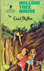
Armada Paperback of “Hollow Tree House” cover uncredited.
THE PUT-EM-RIGHTS
I had this in the Armada paperback format, but it was one I read much later than most of the others I owned. Something about either the title or the cover just didn’t inspire me to read it until I had few other ‘new’ Blyton options. I did read it eventually though and though it would never be a favourite it’s a decent read. The illustrations are by Elizabeth Wall – the original illustrator – and like in the Armada Hollow Tree House the kids are drawn with unusual heads/faces. Being a bit older when I read The Put-Em-Rights I really noticed that of the illustrations. The cover is OK though the girl has a rather 60s look while the other two look as if they’re from the same era as the story.
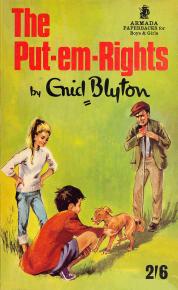
1967 Armada paperback cover by an uncredited artist.
THOSE DREADFUL CHILDREN
Like Hollow Tree House, this was a real favourite of mine as a child and I read it over and over until it was practically falling apart. It was another Armada paperback which featured the original illustrations by Grace Lodge which are quite lovely. The cover looks a touch modern – the boy at the left seems to be in jeans – but otherwise it’s not bad. It definitely transports me right back to a childhood sat clutching that tatty paperback.
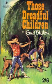
Armada paperback of “Those Dreadful Children” cover uncredited
THE FAMILY AT RED-ROOFS
I wish I could find my old copy of this as it was another coverless wonder. Only this time, somebody had taped a thin piece of card onto the book as a front cover and illustrated it themselves with a picture of a house with a red roof. It must have been another 1960s Armada paperback, and it would have had the charming original illustrations by W. Spence. I think I only read this once as a child, as when I bought myself a hardback copy a few years ago the story wasn’t at all familiar to me. Though oddly I can still clearly picture the home-made cover.
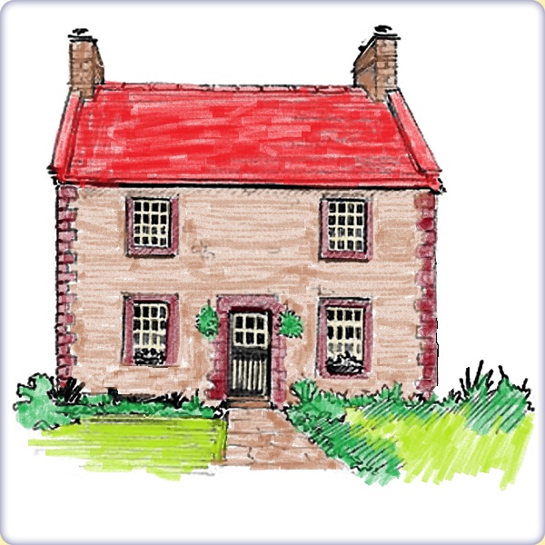
Sort of what the cover looked like. This much more skilled drawing is by Chris Mosley, and coloured in by me.
BIMBO AND TOPSY
I had the rather shockingly pink Dean & Son hardback which I freely admit I never read. My sister (not a huge Blyton fan) read it a few times and rather liked it, but something about the cover just put me off. Not sure if it was the animals (I’m not a big animal fan) or an early sign of my prejudice against Dean & Son. Looking at it now, the cover illustration actually looks more 50s than 70s but I remember it being very shiny which might have been what deterred me from reading it but who knows.
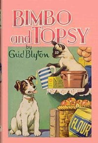
Dean & Son Bimbo and Topsy, cover uncredited
And I’m going to stop there for the moment, but part seven is already written and will be on in the next few weeks. Are/were any of these editions part of your collection?


Very intersting article which shows just how much the look of a book affects whether we read them or not. It’s something that Enid understood completely – just look at the splendid selection of original illustrators of her stories.
LikeLike
Hollow Tree House was one of my favourites as a child. The hand drawn cover on The Family at Red Roofs cover was stuck on and drawn by me!
LikeLike