
The Famous Five books have been in print for nearly 80 years now, and along the way they have appeared with a lot of different looks from the original Eileen Soper covers to TV tie-ins and famous illustrators.
We will all have our favourites – often based on whichever copies we happened to have as children – but let’s take a look at the various different designs.
The inimitable Eileen Soper
All 21 books we first published by Hodder and Stoughton (later called just Hodder) and had their original dust jackets (and internal illustrations) done by the wonderful Eileen Soper. I just love her work. Her depictions of the Five are just how I imagine them, and of course they are perfectly in-keeping with the era in which the books were written.
The first 10 books actually had two Eileen Soper covers – a first edition and then another from 1951. Five on Kirrin Island Again has three – an extra one to correct the direction of the telescope (George looks through it from the wrong end on the first edition cover). Five Fall Into Adventure is the only one where there aren’t two different scenes on the cover, it has the exact same illustration.


Hodder & Stoughton 1942 / Hodder & Stoughton 1951 / Hodder & Stoughton 1943 / Hodder & Stoughton 1951.


Hodder & Stoughton 1945 / Hodder & Stoughton 1951 / Hodder & Stoughton 1950 / Hodder & Stoughton 1951.
As you can see the title font and Enid Blyton’s name changes between the two versions (again except Five Fall Into Adventure which uses the same title font), from Five on a Hike Together they all use the second versions’ style. All the new versions of these covers were published in 1951, so I assume when Five on a Hike Together was to be published there was no point in doing two versions and they just stuck with the newer style.
Then, after various forays into other (and in my humble opinion inferior) artists, there are many later covers using the original Soper artwork.
Five on a Treasure Island uses the first edition illustration eight more times and the second impression another once. Only one is a facsimile with the full cover – the other add various borders and new text. As the series goes on there are less reprints (39 for Five on a Treasure Island, 23 for Five Go Adventuring Again and down to and 17 from Five on a Secret Trail onwards) but there are still at least three later Soper impressions for each book in the series.


Hodder 1997 / Hodder 1997 (hardback) / Hodder 2000 (colour edition) / BCA 2006 .


Birch Tree Publishing 2013 / Birch Tree Publishing 2015 / Hodder 2017 (hardback) / Hodder 2017.
With the first Birch Tree one I wonder why they bothered using the original artwork seeing as they cropped it so small!


Hodder & Stoughton 1954 / Hodder 1997 / Hodder 2000 / Hodder 2017.


Hodder & Stoughton 1955 / Hodder 1997 / Hodder 2000 / Hodder 2017.
I prefer the 2017 editions as they show more or less the whole cover illustration and I even quite like the subtle changes to the colours. It’s nice, though, to firstly see the books being republished so many times and that (for the moment) the series is bookended by Eileen Soper’s instantly recognisable work.
Betty Maxey
From Five on a Hike Together and onwards the second editions are Knight paperbacks with Betty Maxey covers (some have Betty Maxey internally, other retained the Eileen Sopers). Betty Maxey, in my opinion, is far better at covers than she is at internal illustrations.
Up to Five Have Plenty of Fun each book had three or four Betty Maxey Knight paperbacks, and then a Brockhampton edition with the same artwork. The Knights were sometimes the same design with different borders or text and sometimes there were two different designs. Five Go Down to the Sea and the following two books had two Betty Maxey Knights, and the rest had only one.


Knight 1967 / Knight 1969 / Knight 1970 / Brockhampton 1974.


Knight 1967 / Knight 1969 / Knight 1970 / Brockhampton 1974.
As you can see Betty Maxey’s style for covers is very different to that of her internal illustrations. They are much more timeless for a start, and they don’t feature people with missing body parts either! I would even go as far as saying they are quite skilled.
A few impressions later Betty Maxey was back with some new covers, these ones with The Famous 5 on them, and the children looking quite like the cast of the 70s TV series. Strangely she is only credited as having done five covers, from Five Go to Smuggler’s Top through to Five Get Into Trouble. The rest of the series was done in the same style, in the same year, but by an uncredited artist or artists.


All Knight 1983.
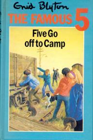
From what I can tell these cover illustrations were used twice, next by Hodder and Stoughton in 1986, but with a blue border. Very few of these seem to exist as very few have been recorded on the Enid Blyton Society website. Five Go Off to Camp is the only Maxey example there.
These Betty Maxey covers are definitely more 70s than the previous ones. As you can see, Anne looks a lot like Jennifer Thanisch, and even the boys’ stylish jackets from the TV show feature. They are different in style to her other covers, with sharper detail rather than being gently blurred.
related post⇒The Famous Five TV Series: Even more funny captions
TV Tie Ins
Both the 70s series and the 90s series have featured on book covers. Up to Five on Kirrin Island Again there were two 70s photo covers, one with a border (not all of them were red) and one which is styled like some of the 70s series annuals.


Knight 1978 / Hodder & Stoughton 1979 / Knight, 1978 / Hodder & Stoughton 1979.
As you might notice the same photo has been used for Five Run Away Together’s second cover and Five on Kirrin Island’s first one. They’ve just flipped it! I’m not sure which episode the photo is from as both feature George’s boat.
As I said above, there are a further sixteen covers with drawn children that look like the 70s cast, but not credited to Betty Maxey. As you can see they are very similar in style to Maxey’s. Again they all seem to have the blue border version, but few examples are available to prove it.


Knight 1983, Knight 1983, Hodder & Stoughton 1986, Hodder & Stoughton 1986
The 90s series also had a photo cover for each book.


All Hodder 1996.
related post⇒The Famous Five 90s Series: Some more (funny) captions
Five on a Treasure Island also had two very similar covers from the 1950s Children’s Film Foundation series.


Klett 1986 / Lektorklett 2009
With there being 21 books and between 17 and 39 different covers for each I’m going to split this into two posts. Next time; my era of Famous Five covers, truly modern covers and the famous illustrators series.


Great stuff! Especially the vastly underrated Betty Maxey section – thank you.
I did not know Betty Maxey was responsible for ‘All Knight 1983.’ covers though??
Any further info?
Regards
Pete
LikeLike
Sorry Pete, I’ve made a mistake there. I was working on this over a week or so and obviously put those covers in the wrong section – and then wrote a load of nonsense to compound the error! I will move them down to the TV section where they should have been all along.
LikeLike
Wonderful illustrations, especially of the Eileen Soper covers. Great article. Lets you see just how important her work was in enhancing the appeal of the Famous Five books.
LikeLike
I like the 1960’s & 1970’s covers it’s amazing what the cover does to transport u back to memory lane the new covers don’t do it for me
LikeLike