
There were far too many lovely covers to put into one post, so here are some more of my favourites.
Grace Lodge
Grace Lodge is another big name in terms of Blyton’s illustrators, having done at least 45 first editions plus potentially hundreds of short stories.
I particularly like the covers for A Story Party with Enid Blyton, and A Picnic Party with Enid Blyton. One of the special things about these covers is that Grace Lodge got to draw Enid Blyton on them, along with the children at the parties.


In a departure from her usual realistic style I also really like this striking later reprint of Three Boys and a Circus by Grace Lodge. It has that red-blue-yellow colour scheme that I seem to be attracted to but I also like the silhouetted animals and people.

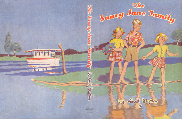
Water
Another theme that revealed itself in the earlier post was covers with water on them. Here are a couple more, from the Caravan Family series.
The Saucy Jane Family looks nice enough with just the front cover (which seems to be how we’ve always shown it on the blog) but the full dust jacket is even better.
Again this has a lot of red, blue and yellow, as well as the water. I love the reflections in the rippling water.
 The Seaside Family also looks even better fully opened out. It’s also full of red, blue, yellow and water so obviously a winner for me. I love beaches as well.

Armadas
These are attractive covers but can’t quite compare to the detail on the larger canvass of a hardback. Some, which I had as children, are most likely nostalgia picks, and even some of the others there’s a certain sense of nostalgia in the style.


The above were all ones I had and looking at them just makes me want to read the book.
Below are two school ones that I didn’t have. I like line drawn green background on the Naughtiest Girl, especially with the green uniforms of the two girls (I don’t recall the Whyteleafe uniforms ever being described as green but for aesthetic purposes they work!)
The pillow fight on The Twins at St Clare’s just looks really fun and the girls sensible uniforms really contrast with the sunny yellow background.


Real Nostalgia
As much as I like some covers I can also appreciate their lack of artistic merit, and the way they contradict the text.
One in particular that I really like is a bit garish. As a child I had this in my head as a group of American girls on a night out – I have no idea why, but somehow this image didn’t say 1940s school girls having a midnight feast. I think the pyjamas look a little like fashionable jumpsuits, and the dressing gowns like coats but where American came from I don’t know.
Anyway, I can appreciate that this is not a great cover but I still like it!
Ruth Palmer
An honourable mention has to go to Ruth Palmer whose modern covers are the only ones I would consider buying. She’s the cover artist for the Famous Five for Grown-Ups books, but has also done covers for both the original and continuation books for Malory Towers and St Clare’s.
Here are a few of her best, at least in my opinion. It’s unusual for me to have a continuation book anywhere near the word favourite but I like the way that the rear window of the car frames Malory Towers on Goodbye Malory Towers.


Did any of your favourites make the cut this time? I have at least one more post planned, for wraparound dustjackets.


I think that saucy Jane cover is gorgeous.
LikeLike
Those Armada editions are the ones I had as a child, and they really stir up the nostalgia. I loved them. The Grace Lodge illustrations are gorgeous and joyful!
LikeLike
The newer editions are not for me.Give me the old,vintage editions anyday. Rashmi.
LikeLike
Hey
Haven’t seen any posts on here for over a week
LikeLike
I know – I have been on holiday! 🙂
LikeLike