
Last week I wrote a great deal about the Stuart Tresilian covers for this series. In my defence there are three different covers for six of the books and two for the other two. That’s twenty-two different designs!
Anyway, after the Tresilians we launch into a wider variety of paperback covers so let’s get stuck in.
A battalion of Armadas
As with quite a few series the first paperback editions of the Adventure Series were published by Armada. (A quick check tells me this applies to the Secret Series, The Five Find-Outers, The Naughtiest Girl, The Adventurous Four, St Clare’s, The Barney Mysteries, Malory Towers… and more.)
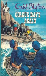
First up there are Armada covers for Circus and River (by Mary Gernat and Peter Archer, respectively). These were done six years after the Thames editions, which missed these titles. I assume Armada ‘filled the gap’ with these two editions before they went on to reprint the whole series in 1969/70.


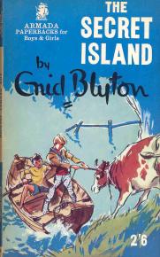
The font for Circus makes me think of old westerns but it’s similar to the font used by Merlin on some of the Galliano’s circus books so it must be a circus-font. The cover for River reminds me of the Armada cover for The Secret Island as it is a similar colour and has a similar scene with a boat.
related post⇒ My childhood books part 3
The full series of Armada covers are actually uncredited I have no idea if they were by the same uncredited or several uncredited artists.


Island’s cover strikes me as pretty similar to the cloth cover on the Macmillan edition, the Castle one is not too dissimilar either. I had Valley and Sea in these editions so I instantly identify with their look and think fondly of the stories within.


Ship and River are rather alike, enough that they could be confused at first glance (in fact I did confuse them when looking at thumbnails!) – Ship could have had the cruise ship more prominent. I think the one for Circus looks more like it should be a Famous Five cover – perhaps for Five Go Off in a Caravan. It doesn’t really suggest ‘circus’ to me at all.
The rare Piccolo examples
I don’t know how rare these editions are, but Piccolo is rare as an Enid Blyton publisher. They did the whole Adventure Series once in 1975, and the only other Blyton books I can even see mention of as having Piccolo editions are The Christmas Book, Birds of Our Gardens, two of the five books about Josie, Click and Bun and The Three Golliwogs.


The Piccolo Adventure Series covers are all by Juliet Stanwell-Smith. I find them a bit pale and wishy-washy both in terms of the colour scheme and the languid poses of the children. What’s strange about the children as well is how tall and thin they look! Some of the scenes used are quite boring, too. Looking at a map in a cabin on a ship doesn’t give any sense of the adventure they’re embroiled in.
They also feature that odd combo of long sleeves with (very short) shorts. I think they do give a 70s vibe but it’s not over the top.
The Repetition of Adventure
One thing I’ve noticed is how often a cover image is re-used. Sometimes they’re entirely reused but made darker/brighter/more blue, or have a different font for the title. Other times they are cropped and used alongside frames, lines and text.
Macmillan did the next two editions for the series, using the same cover image with different text. These covers are by Pamela Goodchild and the children are dressed in 80s fashion, with jeans and bright t-shirts.


Not long after that, Piper published a paperback edition, with covers by Peter Mannim which Macmillan then used on their hardbacks (I wonder if Piper and Macmillan are linked, somehow, like Hachette and Hodder).


These are very obviously of the 90s with jeans, trainers and big puffy jackets!
In between those two sets of repeating covers were another set by Piper with covers by Lynne Willey.


They all had the logo of Kiki beside the titles, and are generally bold and distinctly 80s.
The super modern
Just like the Famous Five books, the Adventure Series then has some crackingly weird covers. While the Famous Five (Hodder) had the children from the waist up making strange facial expressions, Macmillan have gone with extreme facial close ups for this run of editions. In some cases we don’t even get a whole face. They tell you almost nothing about the book other than there’s one child wearing a hood or in water. They all seem to be set in the dead of night and I assume the black background is meant to be dramatic? The artist is Larry Ronstant and he is a digital artist who has done some impressive covers for famous books. Perhaps unsurprisingly these ones don’t feature on his website gallery!


Sticking with the black-and-dramatic theme (and Macmillan), the next lot have the children looking strained/confused and as if they’re not even all in the same place. This is below the title, which is filled with an image related to the story. The artwork is by Melvyn Grant who has moved from oil paints etc to digital painting. I wish I could see the original work that was then turned into a cover, as I’ve seen that some of the original Famous Five illustrations were much better in their original form.


The top inch or so of the book is entirely blank, yet the children’s legs and feet are cut off at the bottom. They always make me think of Shipwrecked (The reality TV show) – well, Island really does, but the rest have a reality TV likeness too.
 I mean The Isle of Gloom is not a tropical island!
The newest full series
At the time of writing the most recent set of covers were by Rebecca Cobb for Macmillan in 2014.
I don’t dislike these exactly, but I do think they are a bit childish both in terms of style/skill and who they look like they are aimed at. This sort of style better suits books for younger children, fantasy/magical books in particular.


These four are probably the best. They are quite brightly coloured and a bit ‘vague’ on detail but they capture the general settings of the books.


And here’s where it gets silly. I don’t remember any part of The Mountain of Adventure featuring a volcano? I mean how is Bill Smugs meant to land his helicopter on top of the flat-topped mountain when it’s suddenly all craggy and spurting lava?
Related post⇒ My top 11 Adventure Series moments
Ship’s not so bad except for the extremely crude smoke coming from the funnel. I actually like the bright colours on Circus as they are entirely fitting, unfortunately the scale is rather off and there’s no way all those tents and vehicles could fit so closely. I also seem to recall horse (and possibly elephant) drawn cages and not modern lorries…
And one last one
Like Five on a Treasure Island, as the first in the series The Island of Adventure got more reprints than the rest. Only two more rather than over a dozen, but still.
The most recent cover of all is the last for The Island of Adventure and it’s a repeating-motif one.

Which is your favourite style of cover? (You can admit it if it’s not a Tresilian one, I understand the power of nostalgia!)


I think I would go for the Thames Tresilian ones, though I do rather like the Pamela Goodchild versions. Although I didn’t have them in those editions, I was that age in the 1980s so it is a very familiar and appealing style!
LikeLiked by 1 person
I’ve seen some of the Thames ones on eBay this week and I’m so tempted. I keep telling myself I don’t need two copies of each book though!
LikeLiked by 1 person
None of them is my favorite style. The only ones which I like and connect with the Adventure series are the Stuart Tresilian covers. Without his illustrations and covers the series is just not the same.
LikeLike
Thank you for the fascinating analysis of all the covers of what is by far my favourite Enid Blyton series.
I totally agree with you that the origina
L covers are the best and are the ones that best capture the characters and stories they illustrate.
I take your point about long sleeves and shorts, but growing up in the sixties we all shivered to and from school in duffel coats and short trousers so absolutely spot on for the time.
I’m supposed you don’t mention that bizarrely Kiki morphs into a Macaw in the Pamela Good child covers, Jack would definitely approve and though I can’t remember Kiki ever being described as a Cockatoo the text descriptions ate quite clear.
LikeLike
Sorry surprised not supposed and Goodchild not Good child unfortunately on my tablet I can’t see what I’ve typed until after posting (maybe the seventies were better!)
LikeLike
I stumbled across this page and have been engrossed for the last hour. Adventure, Galliano’s Circus, Faraway Tree and so on… thank you for preserving a wonderful slice of the past. You made my day. (And GREAT writing too!)
LikeLiked by 1 person
I grew up reading the Melvyn Grant cover ones and so have a soft spot for them. One of the first books I can clearly recall reading was the Castle of Adventure and I am today the proud owner of a complete set of Melvyn Grant cover editions of the Adventure Series.
LikeLike
I grew up reading the Melvyn Grant cover books and so they’re my favourite. The Castle of Adventure one was one of the first books I can clearly recall reading and today I am the proud owner of a complete set of Melvyn Grant cover editions of the Adventure Series. I still read these books every now and then for the nostalgia.
LikeLiked by 1 person