Previous covers through the years : The Famous Five, The Adventure Series, The Secret Series, Malory Towers, The Barney Mysteries, Mr Galliano’s Circus, St Clare’s
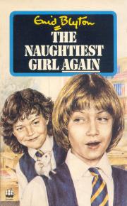
There are only three Naughtiest Girl books if you are counting the original novels; The Naughtiest Girl in the School, The Naughtiest Girl Again and The Naughtiest Girl is a Monitor, but with 12-14 reprints of each there are still plenty of covers to look at.
The first editions
Despite only having three books there are two different illustrators. W. Lindsay Cable (illustrator of the original St Clare’s books) did the covers and internal illustrations for the first two books, while Kenneth Lovell did the final one.
Lovell has done his cover in a very similar style to Cable, and used the same uniform colours etc so it is not a jarring or obvious change.
George Newnes 1940 / George Newnes 1942 / George Newnes 1945
Lovell’s characters perhaps don’t have quite the same air of movement but then they appear to be indoors and under the eye of grown-ups!
The ubiquitous Armadas
Unusually for an early, popular series, there are no new hardback editions. Not every series had those but both Malory Towers and St Clare’s have a second set with new dust jackets.
This series goes straight to paperback (though later impressions of the first edition had a few alterations to the spine design) and of course the 1960s paperback publisher of choice is Armada.
There are two Armada sets, in fact. The first in 1962/62 and the second in 1971/72.
The 1960s set come with the usual Armada look with the brightly coloured backgrounds and illustrations by Dorothy Brook.
Armada 1962 / Armada 1962 / Armada 1963
The 1970s set also have bright backgrounds but a different look; both to the previous covers and to each other! They are not the most disparate covers I have seen, but the sky background in particular between the two orange/yellow ones looks odd. They are by an uncredited artist.
Armada 1971 / Armada 1971 / Armada 1972
The bold and the dull
From 1967 to 1990 we saw a variety of publishers and styles. Merlin, Dean, Beaver and Red Fox all did their own covers, some more than once.
The first was Merlin in 1967/68 with some rather drab and dark covers. I’m never fond of Clyde Pearson’s work it has to be said. His covers are always quite serious and his internal illustrations are often strange. I mean why such dark cloudy skies? Why such dark green uniforms in a grey and green school yard? Why so many black uniforms and details?
Merlin 1967 / Merlin 1967 / Merlin 1968
Dean’s first set (in hardback) in 1972/73 is one of the brightest with the almost fluorescent yellow, bright red and shocking pink along with very stylised cartoon schoolgirls by an uncredited artist. Deans 70s hardbacks are not usually known for their realistic or toned-down covers. These are so stylised they probably get away with it – it helps that there is a ‘vintage’ air to them now as well. It’s just a pity they chose a reddish font for the last book as it’s a bit headache inducing to read!
Dean 1973 / Dean 1972 / Dean 1973
Their second set (also from an uncredited artist) is from 1989 and is very much darker both in colour and content. This set uses their ‘upside down Polaroid’ design which features on so many other series, with a sad selection of brown and beige backgrounds. As for the dark content I refer to ‘sad girl on swing at night’, ‘lonely girl at bus station with pile of belongings’ and ‘two almost drowning children’. The first must depict Elizabeth before she kicks out at Robert though it lacks a sense of anger or suggestion of movement. I can’t remember if Elizabeth gets the bus to school, if so it’s hardly an integral part of the plot. I mean, would these really stand out on a shelf and attract readers?
All Dean 1989
Beaver also have a bright set and a more neutral one, though neither has a cover for the second book.
The bright set is from 1979, and reminds me a bit of Grange Hill for some reason. I think it’s the yellow background and the almost comic strip image. These covers were by Martin Aitchison.
Both Beaver 1979
Beaver’s second set was in 1986, with a very different look. I have a nostalgic fondness for this as my first copy of the Naughtiest Girl was the Red Fox omnibus which reused the illustration from the first book here. Elizabeth reminds me of someone but I cannot think who. I like her cheeky grin anyway.
Beaver 1986 / Beaver 1986 / Red Fox 1995
Speaking of Red Fox they reused these covers for their 1990/92 set, with the cover for the second book done by, I presume, a different uncredited artist as Elizabeth looks quite different. Older and more stylish, perhaps. She also reminds me of someone, an actress perhaps.
Red Fox 1990 / Red Fox 1992 / Red Fox 1990
There is also a sneaky Armada cover in amongst all those – in 1987 they released a new paperback of The Naughtiest Girl Again. This comes under the ‘drab’ category for me!
The Hodder years
From 1997 Hodder took over and have published four full sets of the three books, plus an extra one of the first.
The 1997 set are quite nice in my opinion. They are a little like the modern Hoddern Famous Five covers, and look almost as if they’ve done the same in taking an original cover and giving it a new banner etc. These are by Max Schindler. These are reused in 2000 with a ‘full colour’ badge added, also like the Famous Five. The first cover is also reused for the 2010 70th anniversary edition, cropped, flipped, and with a big border.
Hodder 1997 / Hodder 1997 / Hodder 1997 / Hodder 2000 / Hodder 2000 / Hodder 2000 / Hodder 2010
Then in 1999 they went very modern with two school covers and one that looks like it belongs on a Nancy Drew book, drawn by Paul Davies.
All Hodder 1999
In 2007 they went even more modern (and awful) with covers by Teresa Murfin that make you suspect the children are not altogether human at this school. I have an irrational dislike of the devil horns and tail they’ve added to the font. She’s a school girl acting out, firstly because she doesn’t want to be sent away from home and later because she has a very strong sense of right and wrong but a poor control of her temper. She’s not a devil.
Hodder 2007, Me 2019, Hodder 2007
The middle one is how I see these sort of covers. That’s the School of Roars cast (a series on CBeebies with the voice of Kathy Burke for those of you without toddlers).
Here’s how it really looks, not that different!
And in 2014 the children are also very modern but also angular as drawn by Kate Hindley.
All Hodder 2014
Here’s the Naughtiest Girl
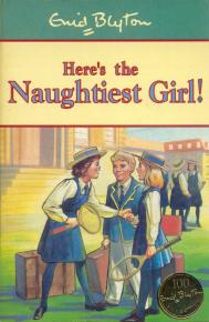
Published as a stand-alone book in 1997, Here’s the Naughtiest Girl was first published in Enid Blyton’s Omnibus. It’s a short story rather than a novel but it’s now printed as a fourth book in the series.
Its first edition is the attractive Max Schindler one,
Then it got new covers in line with the other three books: bright Paul Davies, demonic/monstrous Teresa Murfin and angular Kate Hindley.
Hodder 1999 / Hodder 2007 / Hodder 2014
I’m not going to include covers from the Anne Digby continuations, but they had two sets each. One by Paul Davies and the other by Teresa Murfin. It’s probably sufficient to say they are entirely in-keeping with the style of the ones shown.
As usual, the best covers have to be the originals. Followed perhaps by the modern ones masquerading as old ones. Everyone has a soft spot for their childhood covers, no matter how bad, though!


Lovely lovely lovely but some of them are ugly great books though. Have an average day 🙂 xoxo the naughtiest girl
LikeLike
Jenny and Kathleen and the mouse!
What a moment to illustrate.
I enjoy the Dean Seventies covers – how very Elizabeth at her naughtiest and most anarchic.
The MONITOR cover reminds me of the fifth-form feast at St Clares. [1999]
the IN THE SCHOOL cover has a lot of esprit de corps.
What I would have loved to have seen is a School Meeting illustrated.
[or Nora and Elizabeth working in the dormitories].
It did feel a bit strange to see Elizabeth with brown hair in these later covers.
Must declare something: dressed up as Elizabeth at a Book Week parade in 1995.
And in 2001 I wrote two chapters of the Whyteleafe round-robin – three and five – in the blyton e-group on Yahoo.
LikeLike
As for Elizabeth and the bus in AGAIN:
I think this is part of a lacrosse or hockey match that she played in and she is getting out to see the other school. And check out the opponents.
She and Robert played together that week.
Or maybe she is with other students like Richard and Harry [I always enjoyed those two together, along with John Terry].
MONITOR’s Nineties cover reminded me SO MUCH of Pippi Longstocking [I had got into her opus a few months before THE NAUGHTIEST GIRL series].
[especially Tami Erin’s face if she were blonde].
As for that “lonely” cover – I think Elizabeth was often happy in her own company and she had learnt to be through the latter parts of the Miss Scott years and her parents were abroad.
She has such a lovely personable smile which drew me to the character.
Also the blazer and the HAT! Now there is a broadbrimmed hat with STYLE!
She could have promoted a Slip Slop Slap campaign.
LikeLike
Ah yes – it could be a school match trip. Still, it’s not an exciting, attention-grabbing cover, not does it tell you a great deal about the book. There are some boys to the left so I know she’s not alone as such, and perhaps if I saw the full-sized cover it might show she is smiling, but her just standing there without interacting with anyone is a bit ‘sad’ for a cover which is supposed to be showing us an and eager to be busy and involved girl.
LikeLike
Not even Elizabeth can be busy and involved all the time.
She was fairly pre-occupied with something.
And it was as full-sized as I was ever going to see.
You had never thought of the school match possibility?
LikeLike
Thanks for your detailed comparison. I seen to recall that they don’t wear uniforms at Whyteleafe, if this is correct, the latest covers would be the most accurate ones. I only read the third book though and a very recent version. I was amazed at how old the story is, and also, if all these ideas about restorative justice and self government were known to Blyton, why she wrote a lot more about traditional boarding schools.
LikeLike
They do wear uniforms at Whyteleafe – “The outdoor uniform was a dark blue coat with a yellow edge to the collar and cuffs, a dark blue hat with a yellow ribbon round it, and the school badge at the front. Her stockings were long and brown, and her lace shoes were brown too.”
LikeLike