
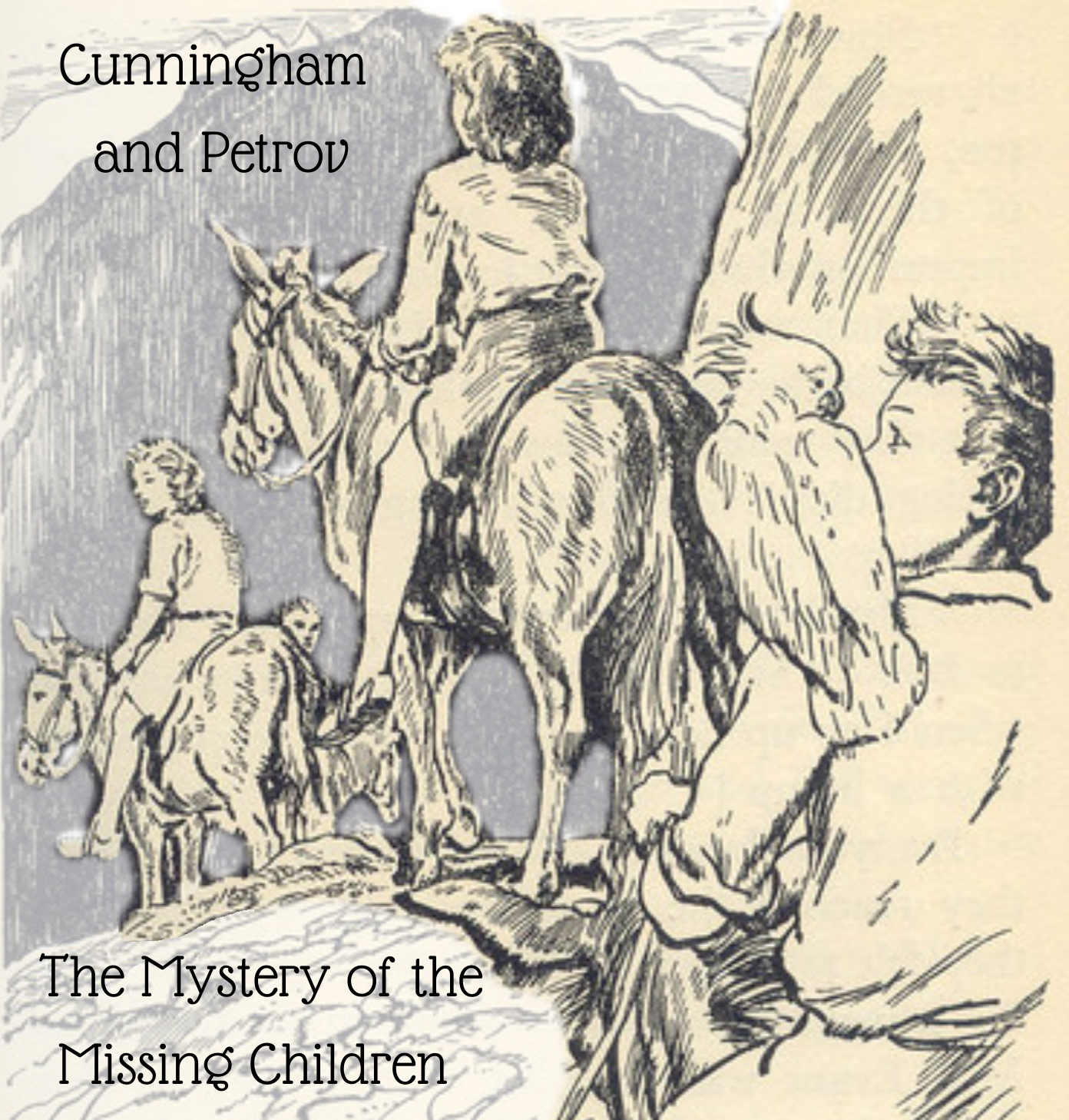
Here we are with a new Cunningham and Petrov story. Our first – The Mystery of the Missing Aeroplane – took place during The Valley of Adventure, the second – The Mystery of the Missing Agent – was during The Sea of Adventure, and so if you know your Adventure Series books you’ll know that this one will set during The Mountain of Adventure.
The book shows us what happened to the children when they disappeared into the mountain, but apart from a few lines at the end where Bill summarises his efforts to find them, we don’t know the details of what he did.
As before this works on the premise that Bill is an SIS (Secret Intelligence Service) agent, and his use of police titles in the books is part of a false identity to cover his real one. Anatoly who is 20 now qualified as an agent shortly before The Sea of Adventure, and has been in the job a year.
Chapter 1
Bill shuffled the last bits of paperwork that had needed his attention and slipped them into an envelope. He sealed it and added the envelope to his ‘out’ tray with a sigh. He had worked hard to move up the ranks of the SIS but he had enough men under him now that there could be a tiresome amount of paperwork at times. Like when one of his men had done something foolishly flashy like blow up an office building – thankfully empty at the time – and the higher ups demanded Bill either justify the move or outline how he was going to handle the agent in question.
At least he was on holiday now. After the debacle in May where he’d had to ‘disappear’ and in fact ended up running straight into the exact enemies he was hiding from, he had been given an extended period of leave which he had decided to save until the schools broke up in July. He and Allie were taking the children to a lonely part of the Welsh countryside for the holidays, and he was looking forward to it immensely.
He whistled a jaunty tune as he strolled down the corridor on his way out of the building, deciding at the last moment to swing by the junior agents’ offices on the lower floors to see Anatoly. He had a mind to invite him along to Wales if he found himself with any free time. The boy had been working too hard of late and could do with a break, he thought.
Anatoly looked up as there came a knock on his small office door. He tiredly shut the file of papers he was taking notes from, information he was trying to memorise for his next mission. He pushed the file off his desk and into his top drawer. “Come in,” he said, his Russian accent surprisingly forward at the moment.
“Just thought I’d stop by and say cheerio,” Bill said.
“Is this you off on your holiday?”
“It is indeed. We head off tomorrow morning. It’ll take us at least six or seven hours to drive to where we’re staying, so I want to get started at a decent time.” He helped himself to a pencil and scrap of paper from Anatoly’s desk and jotted down the address of the farmhouse they would be staying in.
“There’s no telephone on at the farmhouse, but Merthyr Tydfil’s a decent sized place around 15 miles down the road so they can get a telegram to me without too much bother,” he said, passing the paper to Anatoly and dropping the pencil into a battered pot. “Hopefully not being on the phone means they’ll leave me alone unless it’s absolutely necessary.”
“You’re welcome to drop by at any time, of course,” he added casually.
“Drop by?” Anatoly asked, raising an eyebrow.
“Well, travel across and stay if you find yourself with some free time,” Bill amended his phrasing. He personally felt that Anatoly could do with a break, he had been working flat out since becoming a qualified agent and, truth be told, he was a little worried that Anatoly wasn’t giving himself any sort of balance between work and life outside of the job. The role of an agent could be very full on at times but he knew it was important to make use of what down time they got to regroup and recharge.
“I will… think about it,” Anatoly said with a nod. “However, I am in line to be sent out sometime soon.”
“Oh?” Bill asked, raising an eyebrow. “Any ideas where?” He was technically Anatoly’s line manager but with him being off for a time, the chief was going to be giving Anatoly his orders.
“You know I could not say even if I knew,” Anatoly replied steadily, his speech more clipped and sounding like he was new to England instead of raised there. He hated being this way with Bill but there would become a point when Anatoly would have break away and become his own man. The chief had been very clear about that this morning. With his background, language capabilities and talent for the job, Anatoly was a key agent to send out into the field and infiltrate Soviet lines, discover secrets and search for possible defectors to the West.
“I understand,” Bill said, keeping his expression pleasantly neutral. “I’ll be away eight weeks I hope, so just remember you’re welcome to join us if you get back in time. And take care, wherever they send you.”
Anatoly inclined his head in acknowledgement. “I will, I am always careful,” he said quietly. “I should say the same to you. You had better keep an eye on those children.”
“We’re going to the middle of nowhere Wales,” Bill said. “If they can drag me into some adventure there, they’ll be clever.”
He found himself repeating that sentiment in the car the next day as the children joked about falling into an adventure. He said it right before they reached the rambling farmhouse that they were going to stay in so Allie had no chance to deliver another warning about staying out of trouble, like the one she had given him earlier that morning.
“It’s like you don’t trust me at all,” he had said, pretending to be wounded.
“I don’t,” she had said with a smile, and allowed him to kiss her quickly. There had always been a certain something between them, ever since they had met, but it had only been since she had learned that he’d almost been lost to her on that Scottish island that she had expressed her feelings for him.
It was early days and they hadn’t yet said anything to the children – though he felt that they suspected something was going on – so they were just carefully seeing where things would go. Spending eight weeks in rural Wales with four rowdy children would certainly be a good test.



















































 Fiona
Fiona pippastef
 worldofblyton

